Monogram Letter Logo Name Wordmark Typography Text Minimalist Logo

Brand Identity - Construction Company
Hawksvale developers offers Eco-friendly residential and commercial constructing solutions. Their Business Identity is design to express not only the environment-friendly solutions but also the professional expertise of Hawksvale Developers.
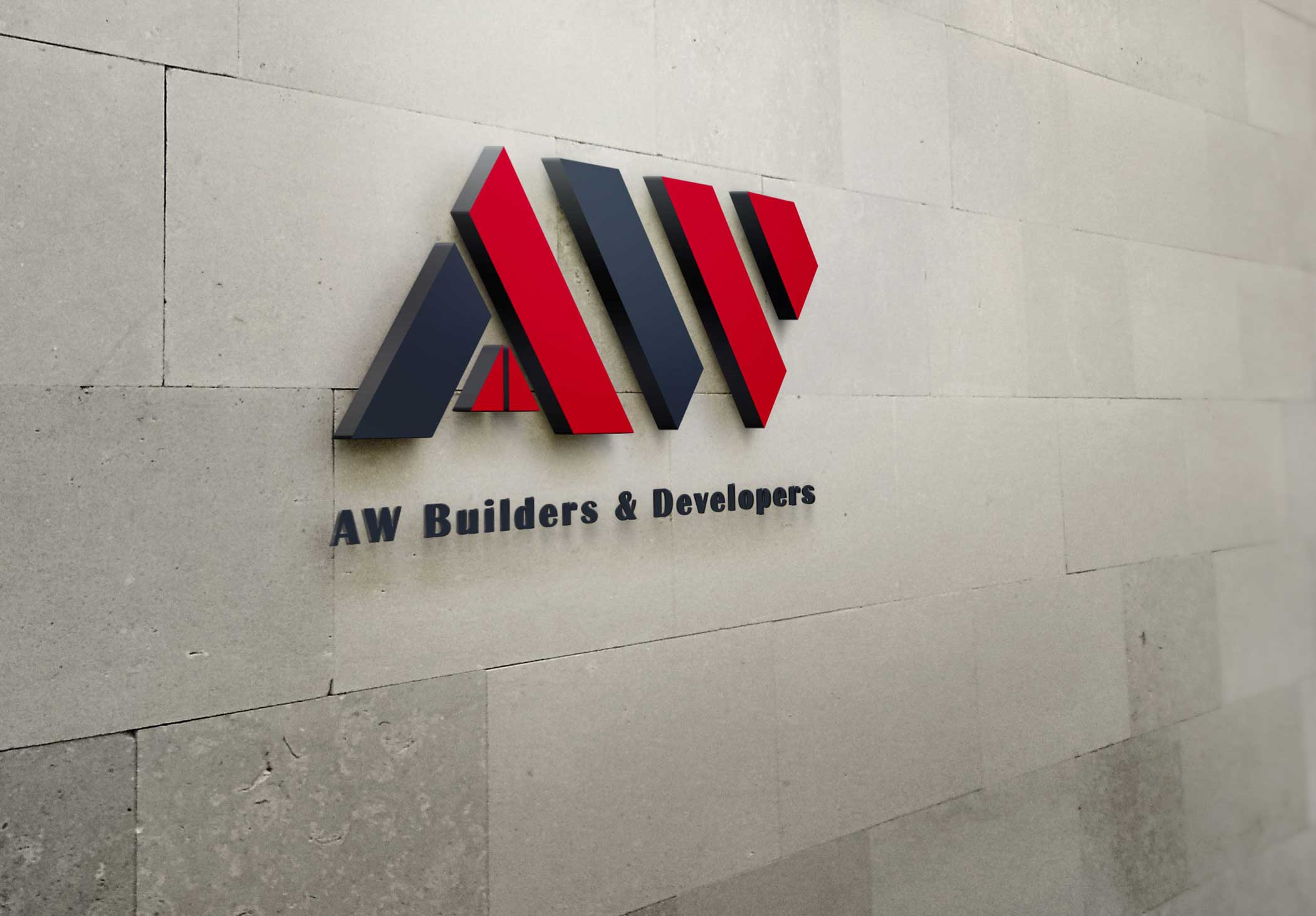
Branding - Construction / Engineering Company
AW builders and developers are known for their diversity and excellence. Their logo design highlights the company’s Dynamic Construction and architectural expertise.

Brand Identity - Real Estate
Howland Dream Villas focuses on contemporary and luxurious lifestyle. Their business identity is designed to indulge all the aspects (luxury, safe and comfort); the company is offering for a perfect home.

Logo - Real Estate
Roof symbols are excessively used in realtors and housing projects, so the idea was to design an icon of roof incorporated within the initial of the company name. The result is a clean and eminent logo that exhibits the nature of the company and also communicates trust and devotion.
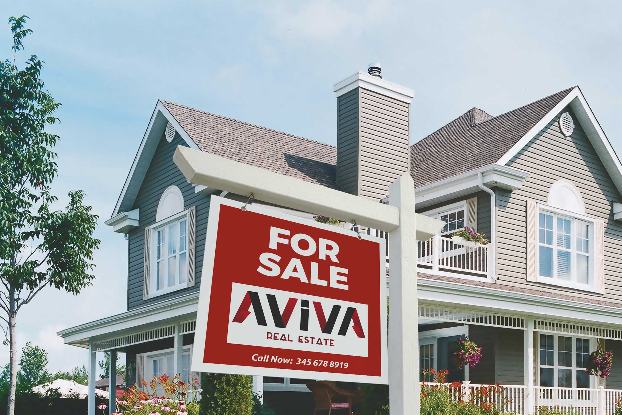
Logo Design - Real Estate
Aviva Real Estate deals in the high end residential properties. The Logo is designed to portray Aviva Real Estate's core values of integrity, honesty and customer satisfaction with a blend of a modern look.

Brand Identity
Insite Hospitality Suites is an emerging business, providing luxurious executive suites. The Logo is created to emphasize the key attributes of the company as well as its continuous progression towards success.

Brand Identity - Healthcare
A smile gives you the confidence to let your inner beauty shine and that is the mission of “JOYOUS SMILE” to help you smile. So, the logo highlights a healthy teeth and a beautiful smile in a careful artistic approach to convey the message of Joyous smile and also to make their identity stand out from competitors.
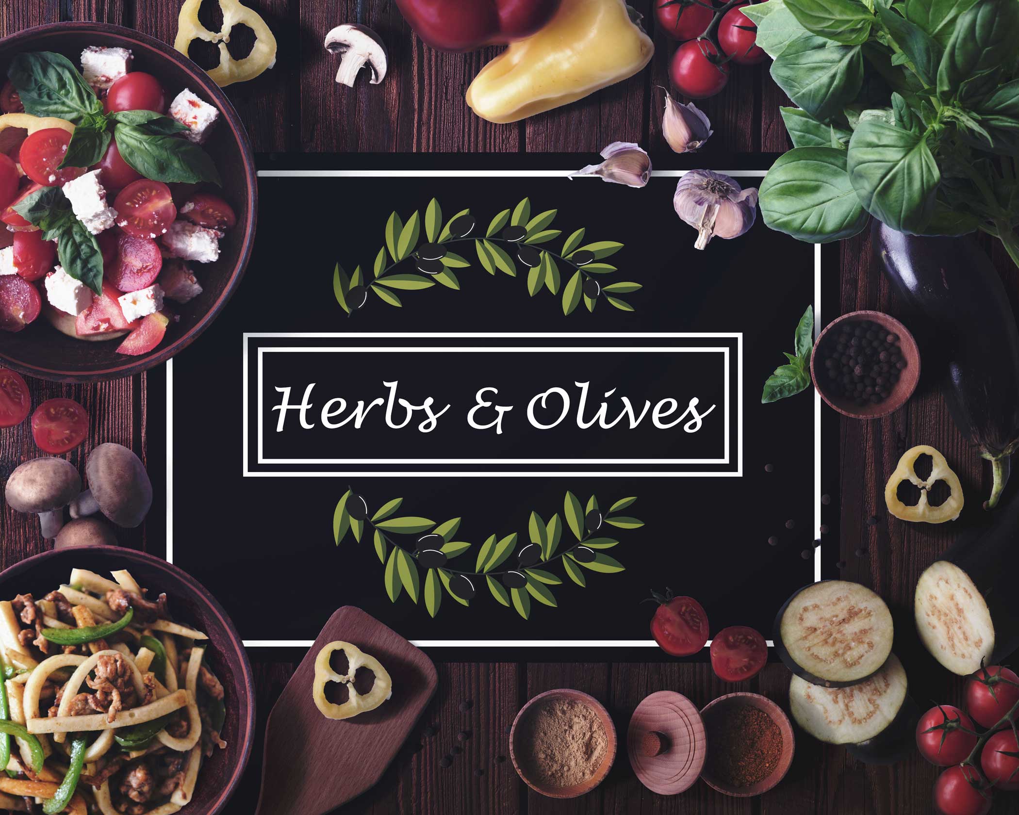
Brand Identity - Restarurant
Herbs and Olives offers an exciting dining experience inspired by healthy vegetarian (vegan) recipes. The main idea behind the emblem is to show the vegetarian nature of the restaurant. So the olive branches are used not only to show the vegan nature but also to symbolize the restaurant's name.

Brand Identity - Fitness / Gym
Spire offers fitness workouts that makes exercising more fun and less of a hassle. The idea was to add fun while keeping overall icon simple and modern. Hence, the business Identity is designed to reflect a sense of freedom, celebration and untiring pleasure.

Brand Identity - Luxury Clothing
Giselle is a luxury women clothing brand. The revolving G in the main emblem is to show constantly changing and trend-setting brand. The approach for this brand identity is simple, modern and timeless yet perfectly reflecting the eminence and grandeur of “Giselle”.
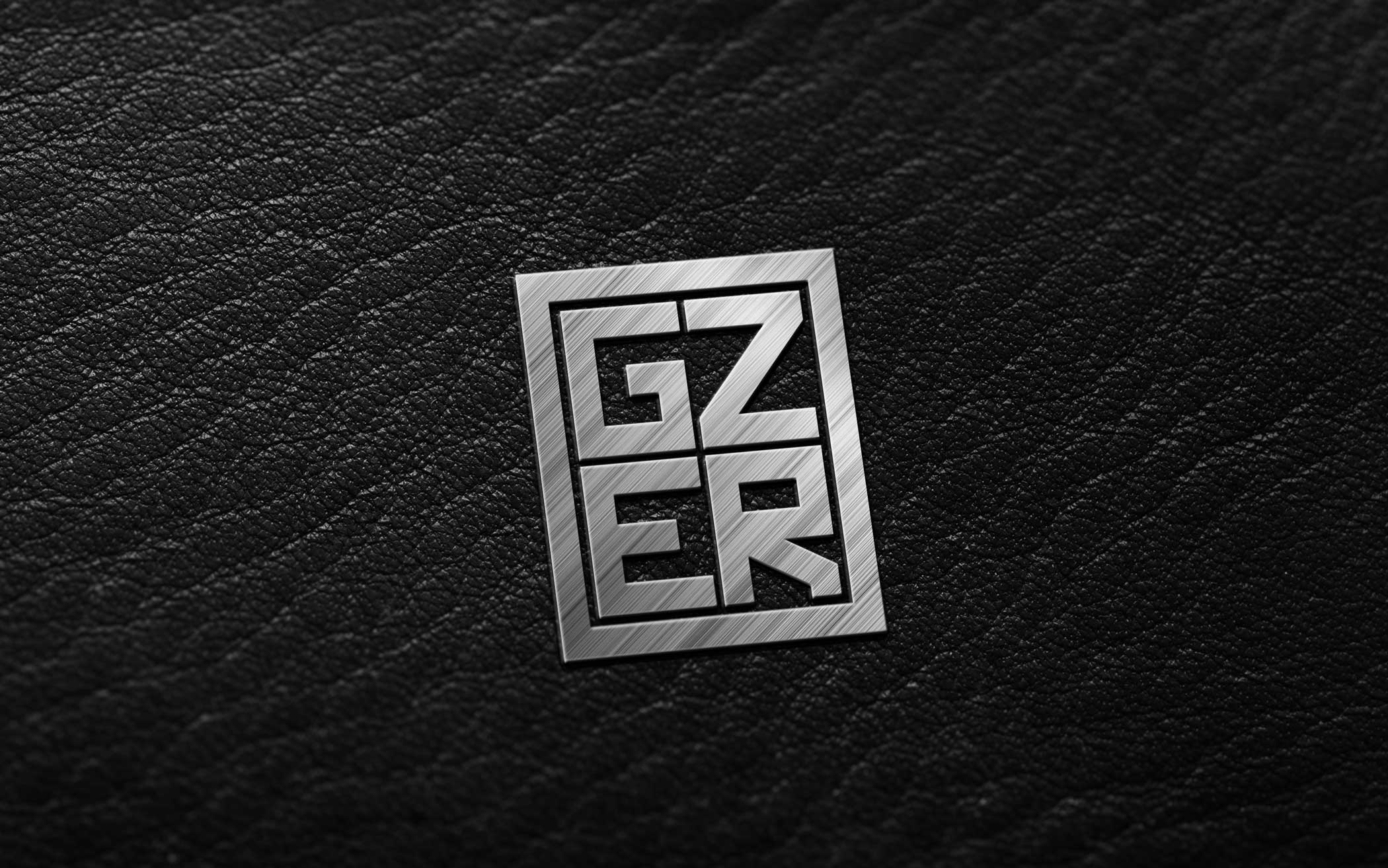
Brand Identity
GZER is known for its high quality leather products and craftsmanship, the company needed a bold and prominent look to distinguish their identity in competitive market. To reflect the brand’s image, the identity badge for GZER is designed as a mark of excellence and grandiosity yet keeping it strikingly bold and prominent.

Logo Design - Banking / Finance
Fortunext is a business and personal insurance provider with a mission to help their clientèles protect what matters today and to prepare for what the future holds. So, a logo design is suggested where the main symbol demonstrate care, responsibility and Trust, yet keeping the overall design simple and professional.

Brand Identity
We were honored to design a complete brand identity package for “Giselle”. The idea behind each design is to show Luxury, High Quality standards and Novelty.

Brand Identity - Healthcare
Dr Barbara Holland at Smiles of NC is creating beautiful smiles using latest techniques and decade long of experience in dentistry. The Logo of “Smiles of NC” unveils an unpretentious and professional look of company.

Stationery Design - Finance / Insurance
Fortunext is a business and personal insurance provider. The main idea for this stationery Design project was to keep the design simple yet professional.

Brochure Design
Stardust is a leading Gold and Diamond jewelry store, the brand required a brochure design for their upcoming Bridal Gala collection. This brochure is designed to display luxury and splendor, with a highlight on some salient designs and a hint of their artistic approach to craft each jewelry item.

Logo and Package Design - Salon / Barber shop
The package design for Florence Hair Care – heat protect hair serum is intended to display an exceptional and high quality hair care product.

Brand Identity and Packaging Design - Healthcare
Derma Consultants are manufacturing safe and healthy Hair and Skincare products. Their approach involves revitalizing the skin’s natural resources to help it recover its natural functions. For this business identity a Butterfly symbol rendered in bold colors is used to express transformation to a new beginning and hope.

Brand Identity and Packaging Design - Healthcare
The mission of the company is to manufacture 100% natural and organic supplements for healthy life. We designed a striking yet minimalist Identity that focus on the organic products while emphasizing the main aspects of trust and reliability.

Brand Identity Design - Healthcare
Boron offers a large range of Natural Nutritional Supplements to fulfill all requirements of a healthy body. The purpose of this design was to keep it unpretentious and remarkable to distinguish “Boron” in competitor market.

Package Design - Food company
The goal of the package design for Nature Fresh Orange juice is to make it exceptional and prominent in competitive market. A transparent bottle with a splashing orange slice is not only a mark of purity but it brings a sensation of freshness and excitement as well.

Branding and Package Design - Food Company
Frozen Potions manufactures a wide range of Ice-creams and frozen-yogurts. A Wordmark is suggested for Frozen Potions with a delicious and magical effect to make the company name bold and appealing.

Branding - Self storage
Austin self-storage provides storage units in several sizes with state of the art facilities and high level of security surveillance. The monogram of Austin Self-Storage is designed to express security, trust and credibility.

Logo Design
Optica Imperio is a Spanish optics brand that offers a vast range of high quality spectacles. The logo design centers on a bold and meaningful signature to emphasize quality and reliability.
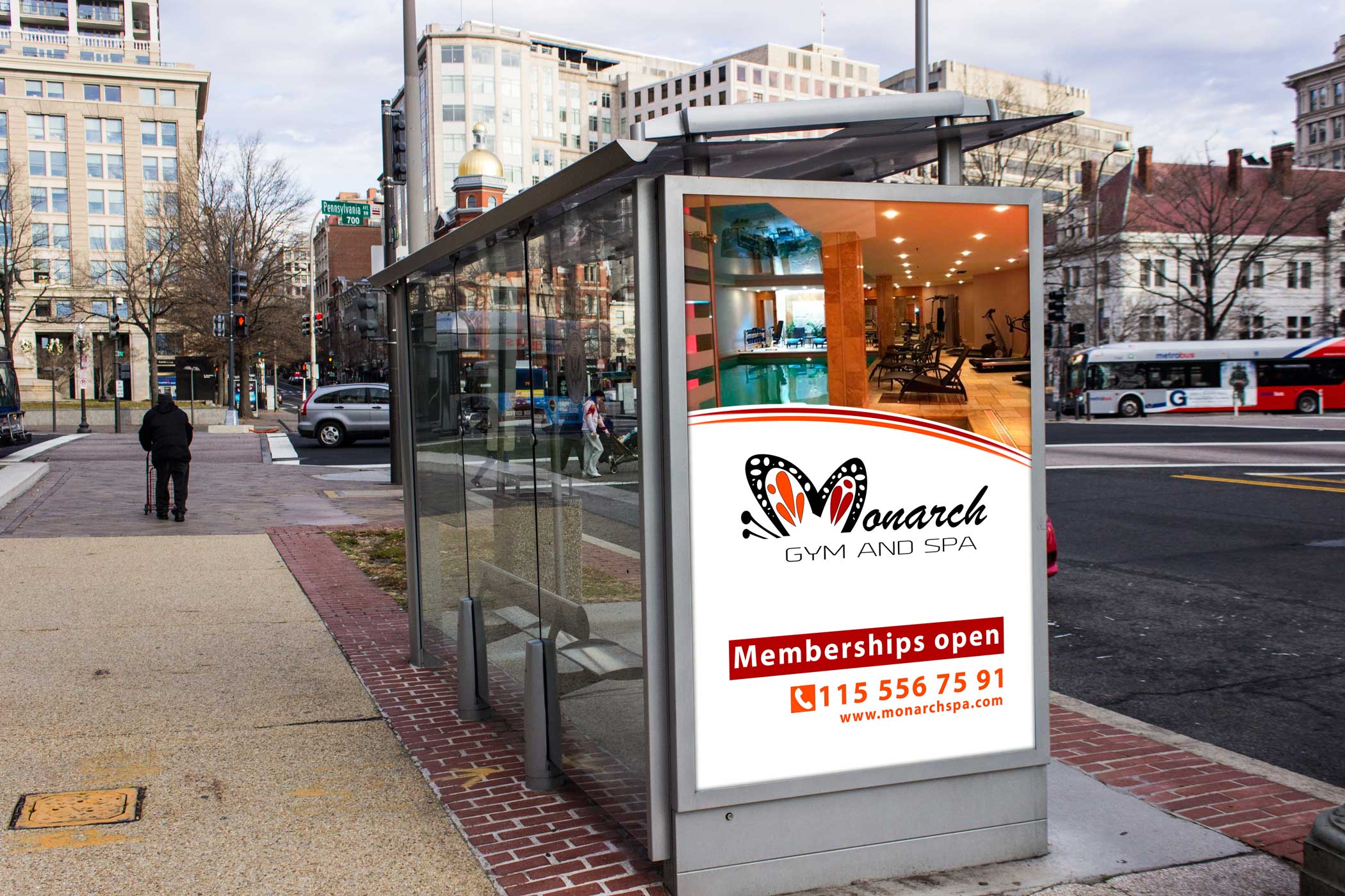
Branding and Outdoor Advertisement Design
Monarch Gym and Spa is a tranquil sanctuary for personal fitness and meditation. For this project we focus to reflect a playful and energetic image of the brand while incorporating a Monarch Butterfly symbol to comply with the name of the company and a hope for a healthy change.

Billboard Design
The purpose of the billboard for Arizona Real Estate was to advertise the brand exposure and lead generation. So it was designed to highlight the company's values of professional services and customer satisfaction.
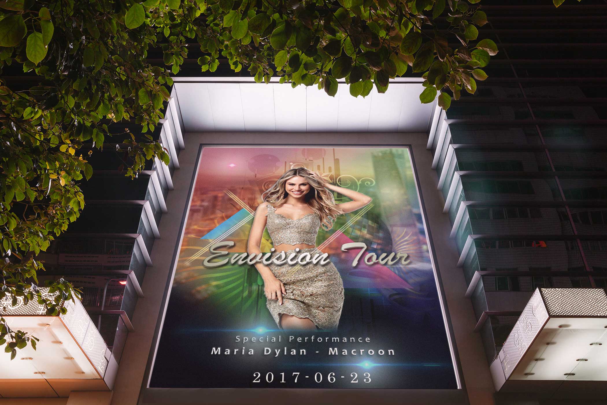
Billboard Design
Envision Tour
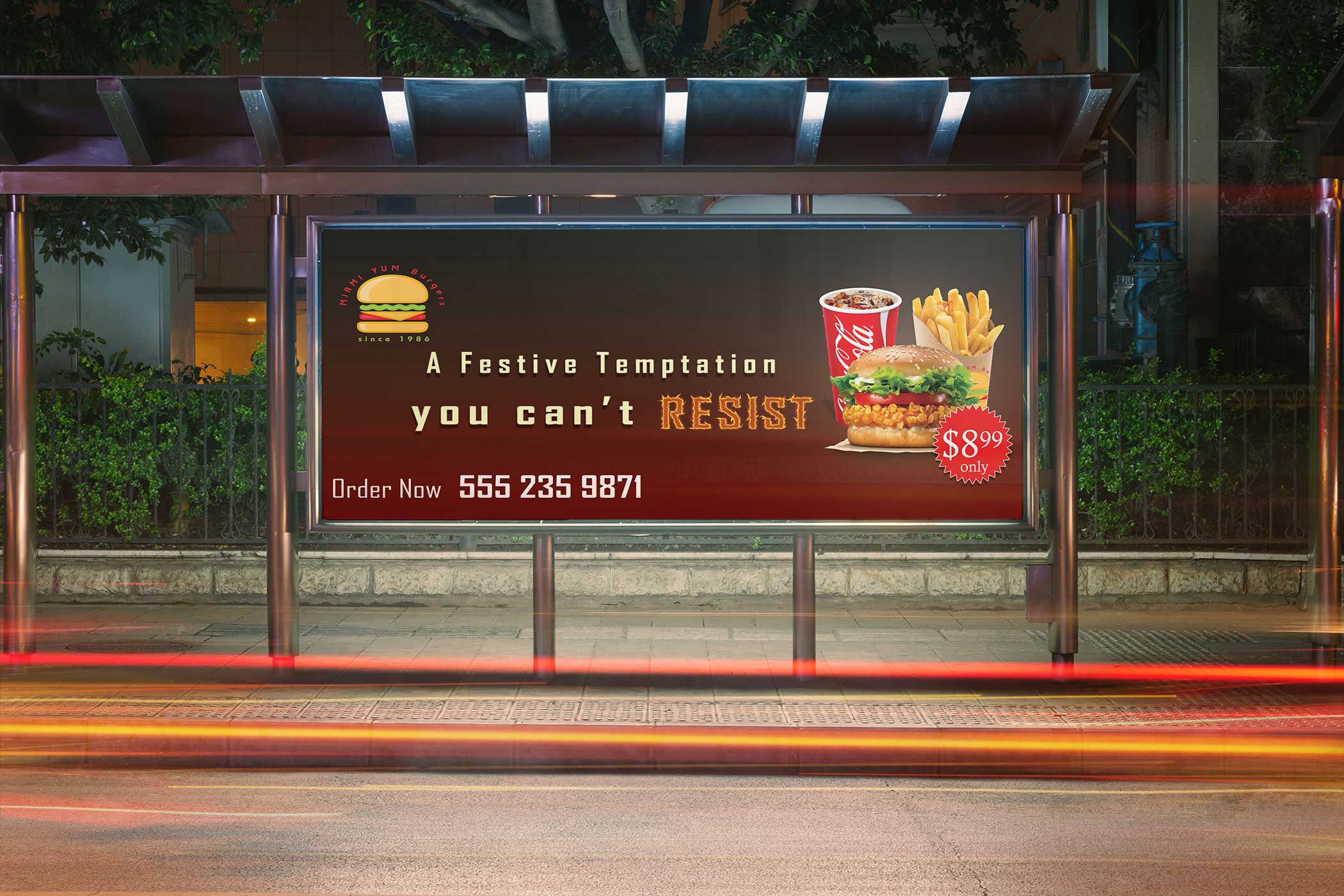
Billboard Design
The purpose of this billboard is to grab the attention towards the mouthwatering deal of Miami Yum Burger and light-up a desire for the hot and delicious burger.
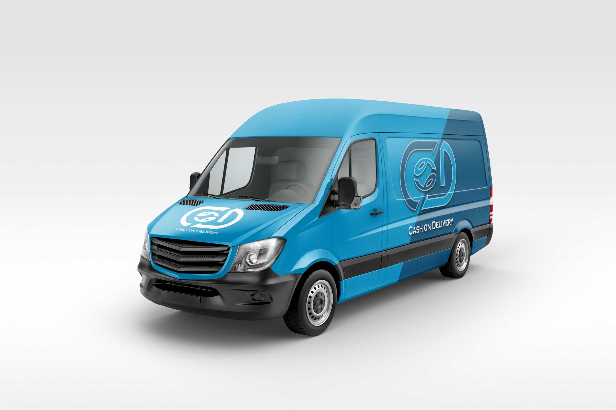
Branding - Delivery / Transport company
COD as the name suggests offers Cash On Delivery services. The purpose of this emblem is to express a transparent and secure exchange while keeping the identity proficient, minimalist and timeless.

Branding - Electric company
Electrical Perfection are licensed electrical contractors known for their responsiveness and professionalism. For “Electrical Perfection” an identity is suggested that artistically incorporate Bulb and Maintenance tools within the name of the company that makes it unique and clearly portrays the nature of the company.
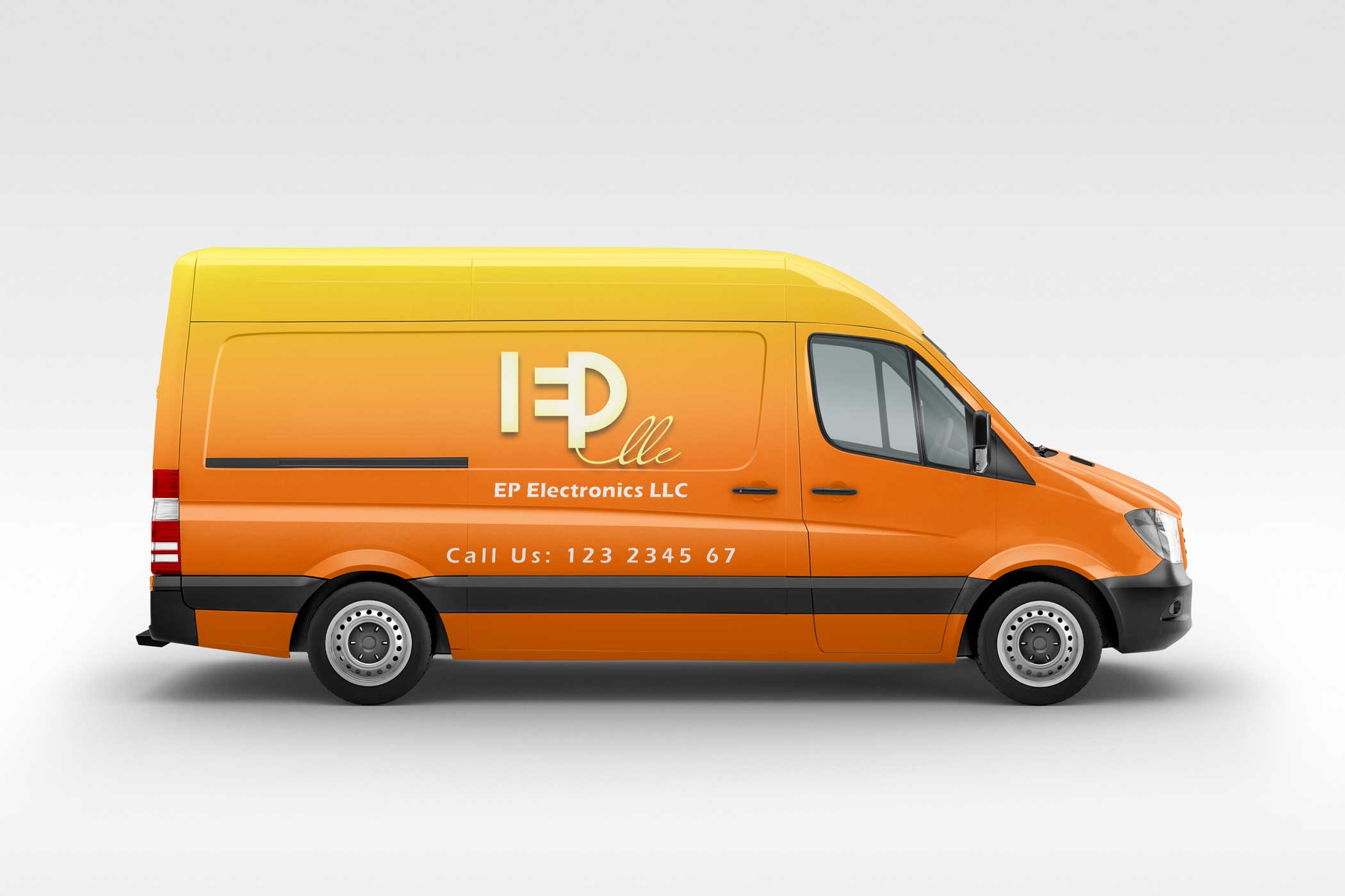
Brand Identity and Vehicle wrap - Electrician
Edward Pierre’s EP electronics is a fully licensed electrical contracting company offering services for high-end residential and commercial properties. Their logo is designed to portray a versatile facet of the company. With E in negative space and a bold P, the logo also depicts a symbolic Plug, Socket and wire to represent the EP electronics LLC.